


 />i
/>iWhat’s nice about eye-track testing is that it shows precisely what grabs your viewers’ attention, what they see, in what order, and how long they linger at each point.
That’s incredibly powerful data.
In important cases, trial lawyers don’t guess what’s going to work with the jury, they find out — they conduct jury research. Then they use that data to improve their results. Of course, that’s not to minimize the significant value of decades of hands-on experience. But when you can get accurate data, use it.
Market research is expensive; it’s not possible in many situations. But when it’s cost-effective, it can take something great and make it even better.
So here are two website designs we developed a few years ago for a 250-lawyer firm, two different ways to convey the same message regarding the firm’s new London office and English-Law Aviation Finance lawyers, see GlobalTransportationLaw.com.
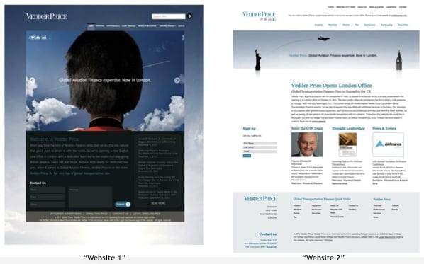
The website design one on the left (“HATS”) has a big photo that is more visually interesting, and the overall campaign is designed to be a tad more humorous. The right website (“ICONS”) also has a strong conceptually theme in the Hero/Banner section, but is more focused on the content.
In our experience, both would work great, achieving the firm’s goals. But which one accomplish those goals more effectively? Testing can help you find out. Here’s how:
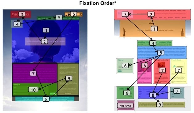
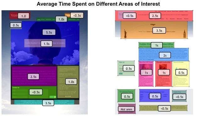
In the highly visual one on the left, the vibrant Beefeater hat is what you see first (see “Fixation Order” graphic), which holds viewers’ attention for an average of 5.5 seconds (see “Average Time Spent…”), before they get to the headline, which they read for 1.5 seconds. In the version on the right, they go straight to the critical headline.
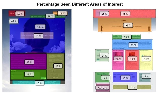
What’s also important is that although 100% of the viewers saw the big black hat, only 81% noticed the headline below it (see “Percentage Seen…” below).
That indicates that if we selected the “Hats” version we should probably enlarge the headline, (which would likely cause our designers to complain just a bit about hurting their aesthetic. Well… tough.) Contrast that with the overwhelming 96% who read the headline in the “Icons” design on the right.
In both layouts the firm name is the third place viewers’ eyes go. Excellent.
In the “Icons” design, the important content headline is the fourth visual point, and viewers spent 2.5 seconds reading it, then spent 4 seconds scanning the supporting News paragraph. That’s good.
In the “Hats” layout, the actual information we want them to remember is not noticed until the SEVENTH Fixation Point. This layout takes a bit too long to get to the real information, and we risk losing the viewers before they learn what we want them to know.
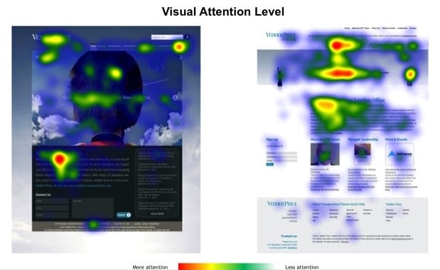
When the viewers DID get to that paragraph on the “Hats” design (left), they only spent a scant 2.5 seconds reading it. Contrast that to the “Icons” layout (right), where they stayed for 4 seconds — spending substantially more time reading that same paragraph.
What’s the point?
Great web design doesn’t just make something attractive. It makes it effective.