


 />i
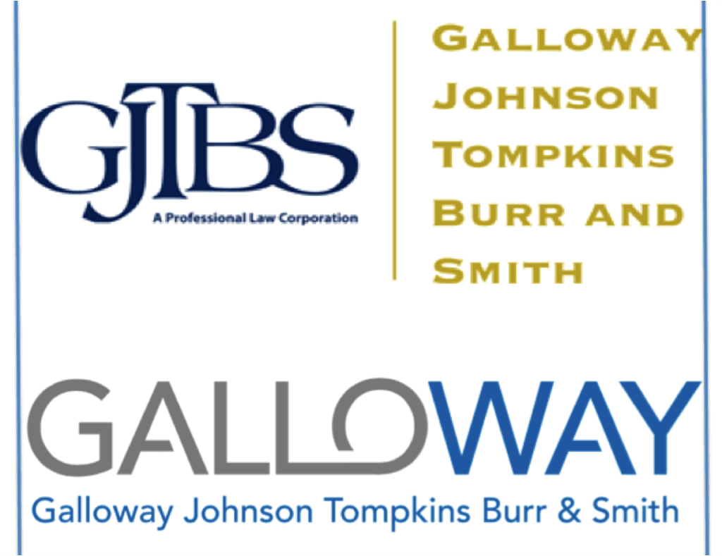
/>iWe’ve been working with a terrific firm, Galloway, Johnson, Tompkins, Burr & Smith. This has been their logo for many years. It’s a very common logo structure, particularly for firms with four or more names on the door:
![]()
The problem of course, is that the marketplace rarely refers to a firm by its initials (as detailed previously, here), and the giant initials distract viewers from the firm’s colloquial street name. In this case, everyone casually everyone automatically short-hands the name to “Galloway” or “the Galloway firm.”
Of course, no one thinks that the abbreviation means that Mr. Galloway is more important than the other lawyers. The legal profession resolved that issue decades ago when firms started shortening their logos. It’s a simple matter of a busy world where everyone looks for shorthands and abbreviations. “Galloway” comes first and it’s a good enough word that we can stop there without confusion. So we do. Simple.
When highlighting initials, it can seem logical to use the unwieldy GJTBS.com domain name. (Or was it GTJBS.com? Oh who can remember? You can’t, and I just showed you the logo three vertical inches and 15 seconds ago.)
So as part of the rebranding process, after a strategic discussion, the lawyers agreed to enlarge the word “Galloway,” to make it easier to remember the firm and find it online. So we changed the alphabet-soup collection of initials to a more streamlined logo, below.
![]()
Of course, we kept the rest of the names below it, because that is the firm’s name. And where possible I like to use it. The real point is the strategically simplified gallowaylawyers.com is a heckuva lot easier to remember, and the rest of the gang agreed. We’re overhauling the Galloway website, which will be ready shortly.
Here they are, the before and after, at the same width.
It’s fairly obvious which one works best. Take a couple steps back from your computer and let me know which you can still read clearly:
I’ve written about this Giant Initials issue before here, and discussing the accounting industry’s use of initials (KPMG, PWC, E&Y, RSM, UHY, etc.) here and here, including generally why it’s stupid for them too.
The reason I’m posting again on this issue ![]() is that we recently rolled it out at a national industry conference where the firm was a primary sponsor, getting their name on the giant screen, opposite a fine firm that hasn’t yet fixed their identity problem.
is that we recently rolled it out at a national industry conference where the firm was a primary sponsor, getting their name on the giant screen, opposite a fine firm that hasn’t yet fixed their identity problem.
Do you know this RMKB firm?
Of course not, that’s not what everyone calls them. The difference is obvious. Which firm name will you remember tomorrow? Whose firm will you be able to find online most easily?