

 />i
/>iA logo is the first contact many prospects will have with your firm, for example, on a business card when meeting one of your lawyers at a conference. It can help set the tone for their thinking about the firm, and its quality and professionalism. Does it LOOK professionally designed? Does it convey the sense of a high-quality organization?
We’ve redesigned over 100 law firm logos over the years, most commonly as part of a larger firm rebrand, and we always begin with a process to discover the brand message the firm wants to convey to the marketplace. Has your firm first decided what its message is? Are you tough or intellectual? Creative or traditional? Efficient, friendly, tech-savvy, or edgy? Because once you know specifically what you’re saying, that’s the vital guidance to offer to a designer.
BTW, logo design is a narrow subspecialty area of design. Not every “graphics designer” can really create great logos, just like not every lawyer can handle every kind of legal practice. Our logo designer spends his entire life exclusively designing logos. That’s it. Not websites or professional announcements or advertisements. He lives in the world of glyphs and font families.
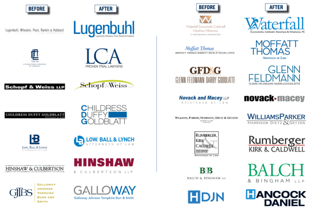
In this way, he doesn’t simply default to using what we call the “giant initials”-style of logos. See more here. Below is a before-and-after example of how we changed one firm’s “giant initial” logo into something much more readable, at the same width. More than a redesign, it required a strategic process to get the lawyers on board with the idea of emphasizing the firm’s “Galloway” street name.
![]()
A logo is a little piece of art, and your lawyers and professionals can have very different feelings about the type of artwork they like. Some may like impressionists or modern art, others like basic “still life with fruit,” and others might prefer “dogs playing poker on velvet.”
We must help all of them see why the logo says something about the firm that would make them proud to pull it out of their wallets. Because if they don’t like the color or design, the Marketing Committee is going to hear about it for a lonnnnngggg time. Some lawyers will simply refuse to hand out their cards. (Trust me, this happens.) Logo redesigns are much more difficult projects than most people realize.
Here’s a place to start, our blog post entitled “C’mon, it’s just a logo. How hard can it be?”
Below are a few more logo redesigns. Each required more than a simple tweak to the font or layout. Done right, logo revisions require strategic thinking to clearly determine what the firm wants to say to its target audience(s), and how to connect with them.